A bold brand for AI-native film
Client
Chunky Panda
Year
2025
Delivered in collaboration with bilal.agency. Chunky Panda is a Berlin studio building the production workflows for AI-native filmmaking, blending real cinematic craft with generative AI pipelines. They needed a site as forward-thinking as the work itself: a heavyweight typographic identity, a memorable panda mascot, and motion that felt alive. Our work focused on a bold, high-contrast aesthetic that positions the studio as a next-generation player, delivered fully responsive in Framer on a one-week timeline.
Scope of Work
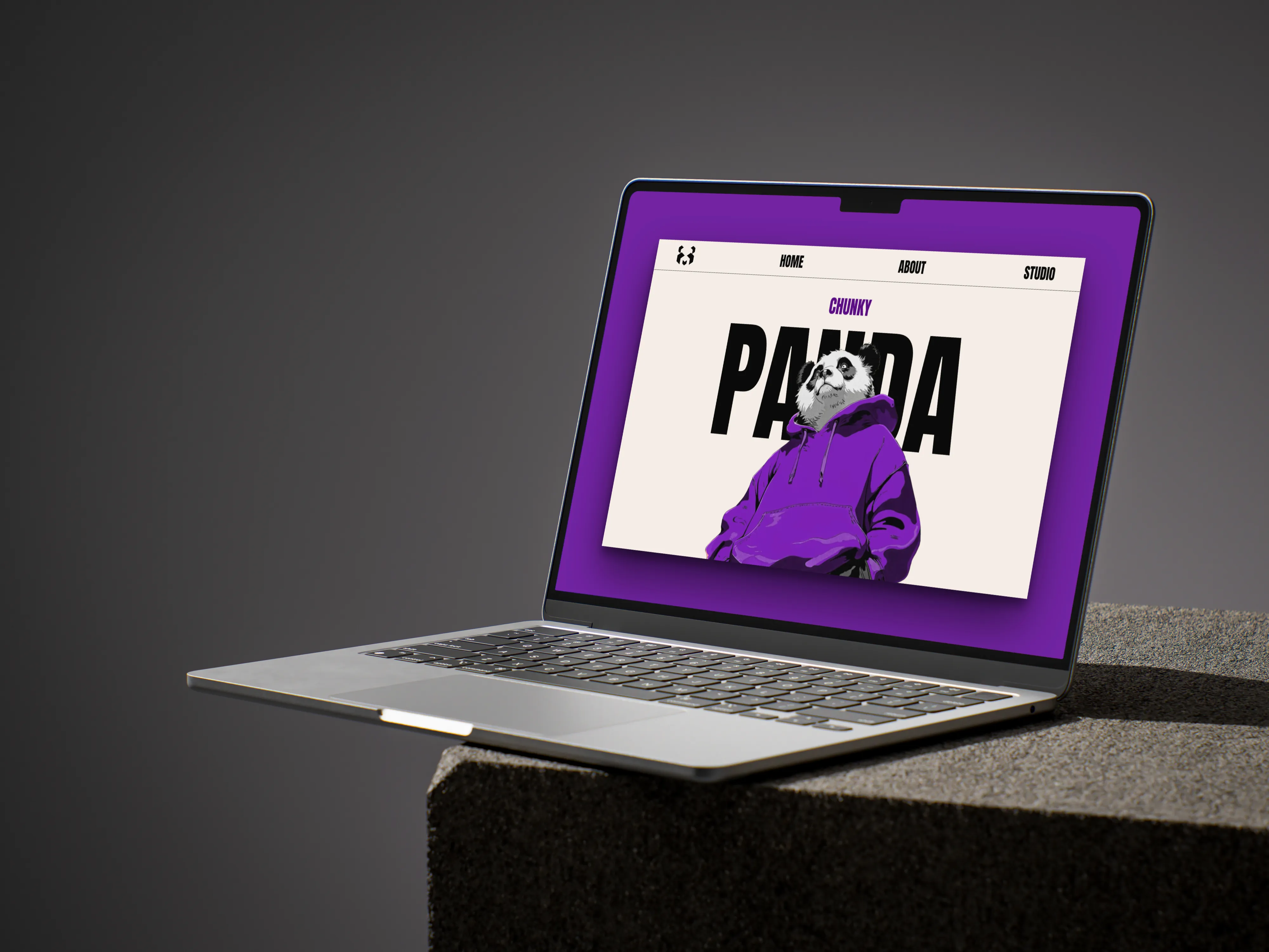
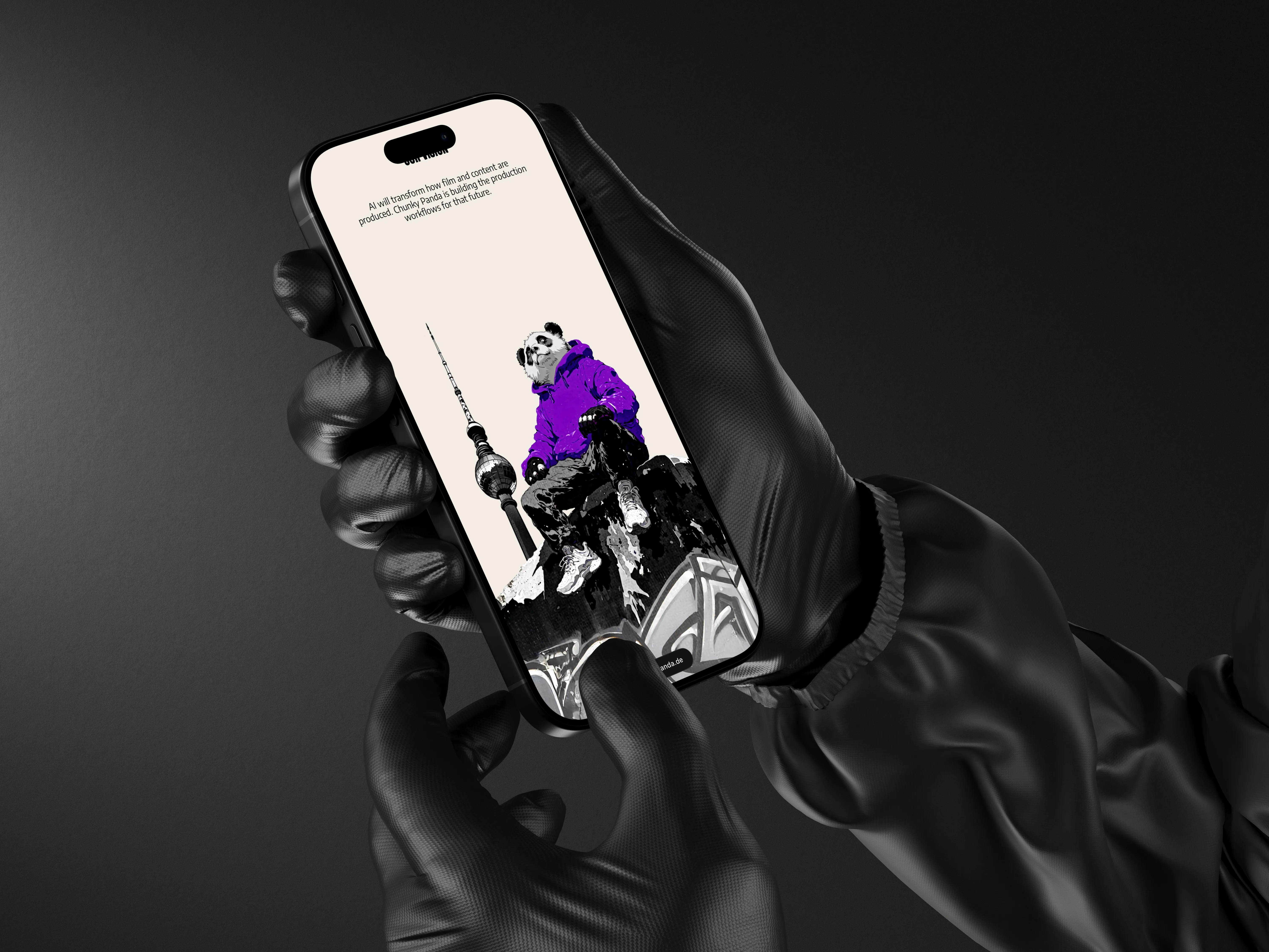
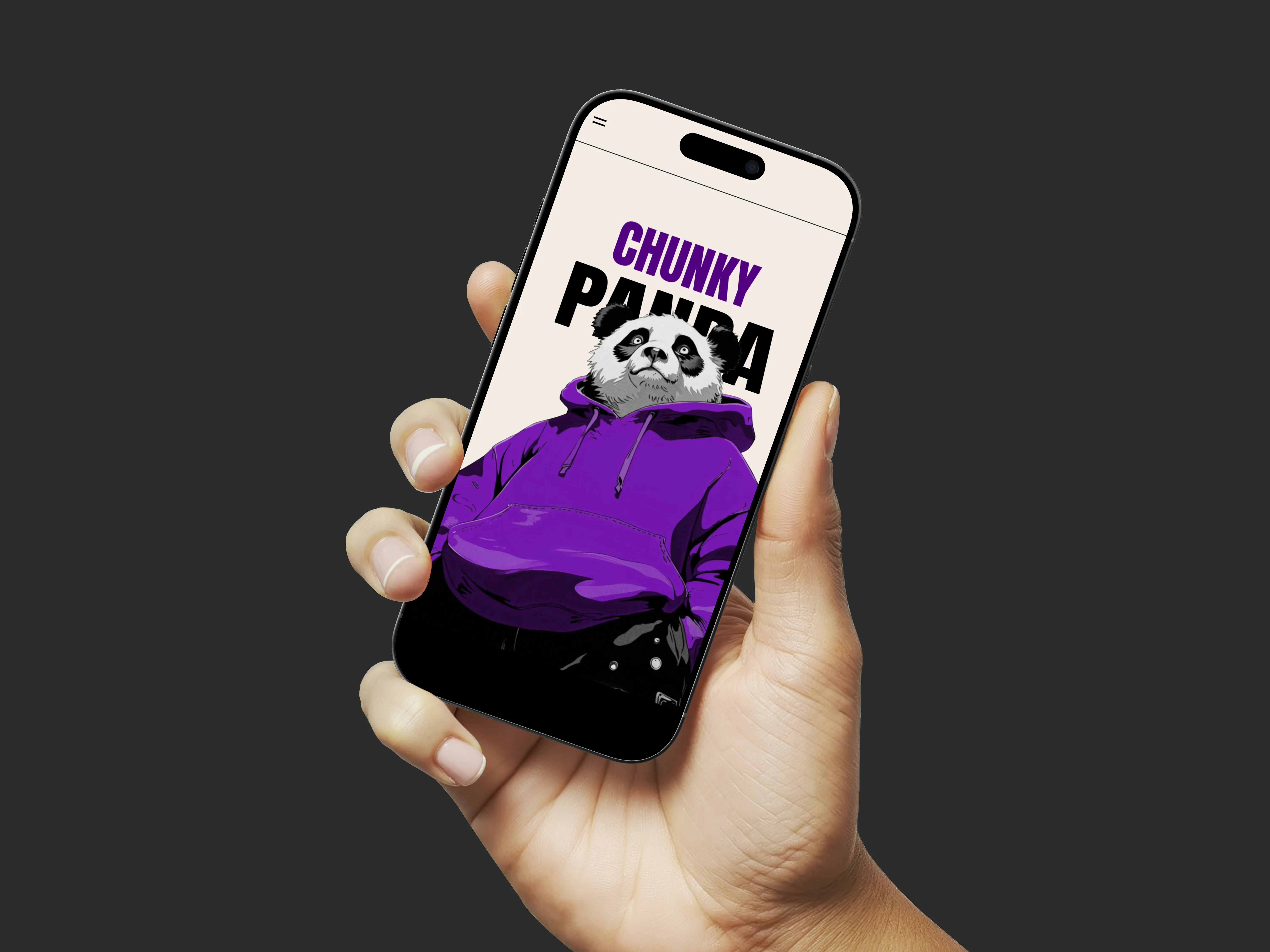
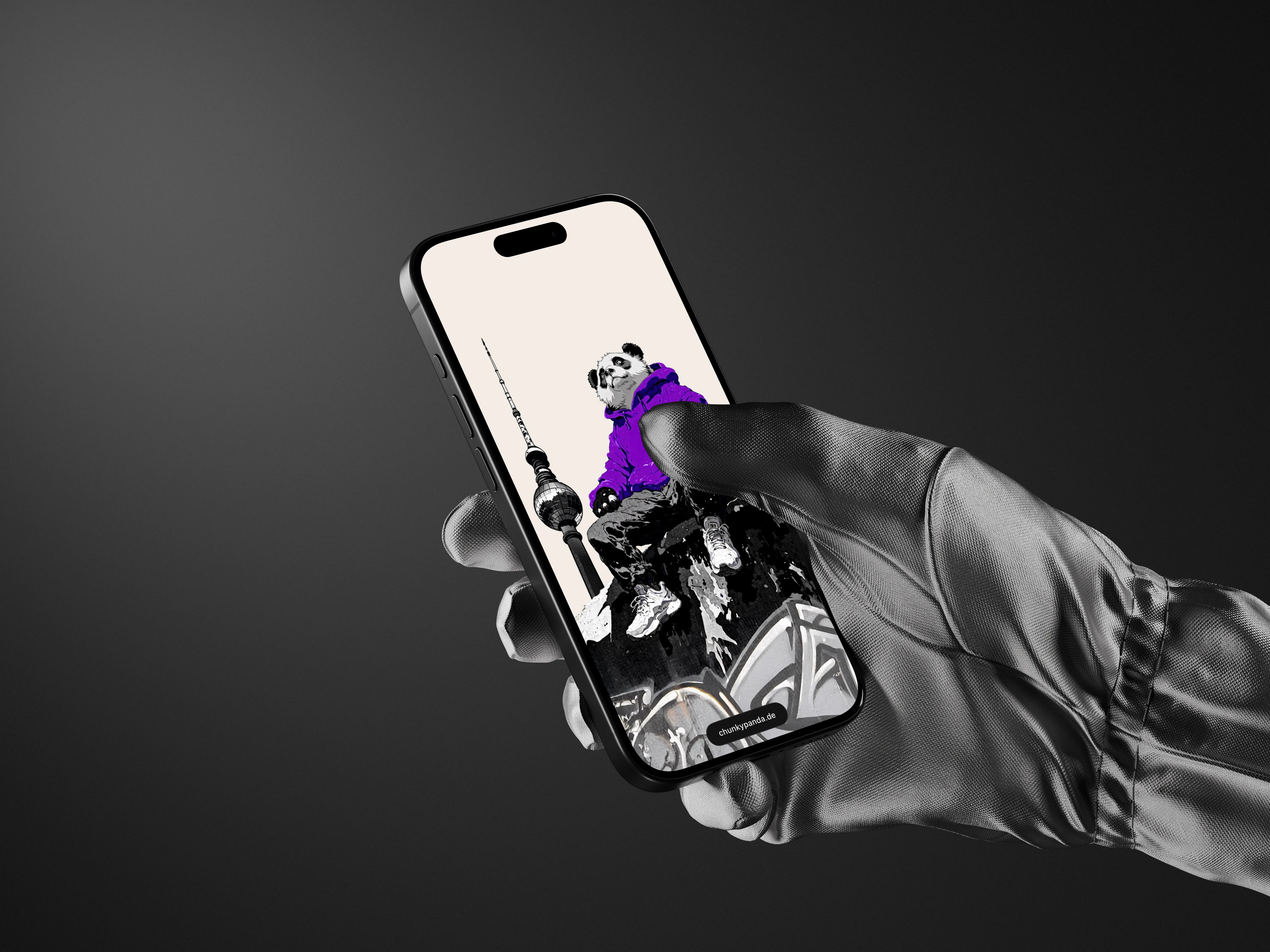
The hero leads with a towering PANDA wordmark and a friendly mascot, setting a confident tone the moment the page loads. Violet carries the accent work against a warm cream ground and deep black panels, giving the brand instant contrast and personality. Every element was built to feel bold at first glance but still calm enough to read, so the studio comes across as ambitious without feeling loud.

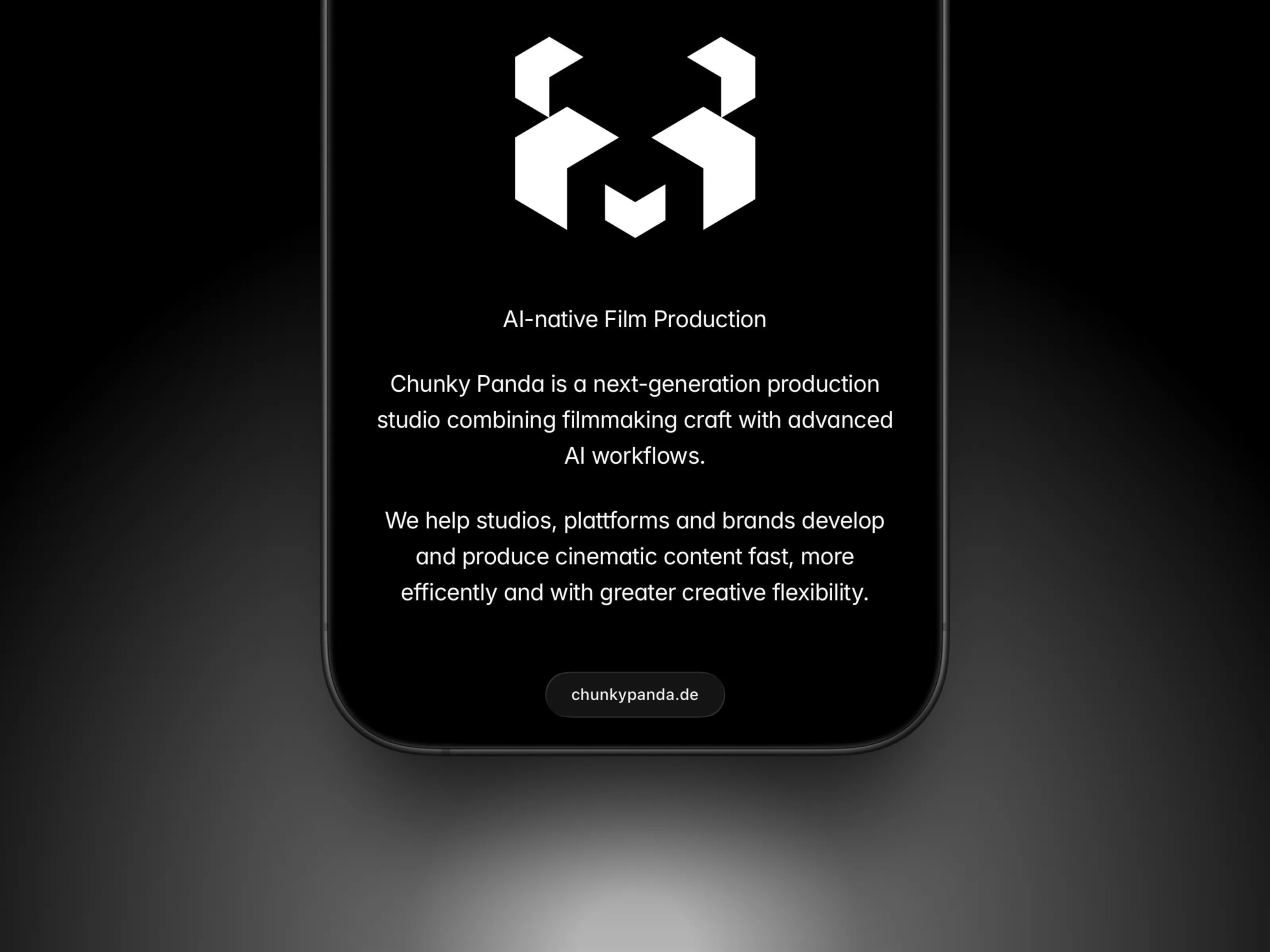
The original brief referenced a blinking-panda animation. Framer's native tools couldn't replicate that exact effect, so I built a smoother, variant-driven blink using component variants, a cue that reads cleaner than the reference and performs well on every device.
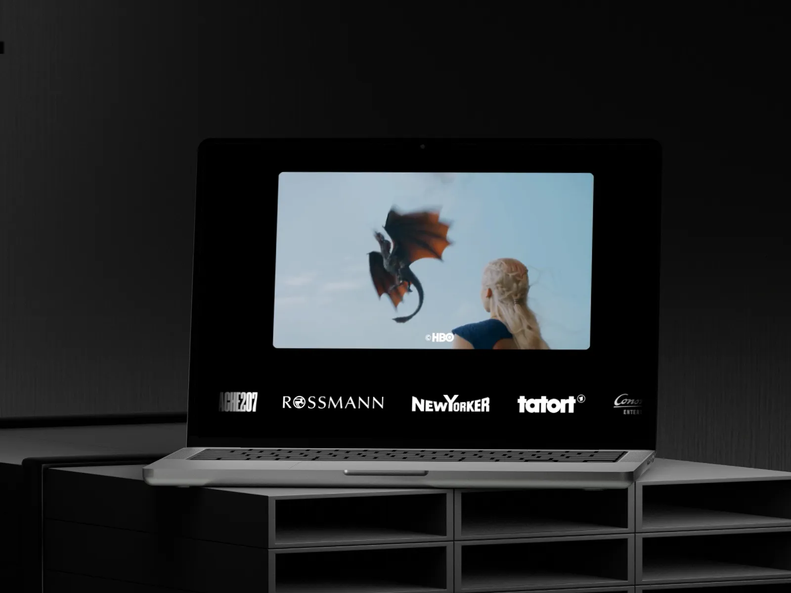
The client later produced a full mascot video of their own, which slots straight into the layout and gives the brand a striking, cinematic centerpiece that ties the whole page together.
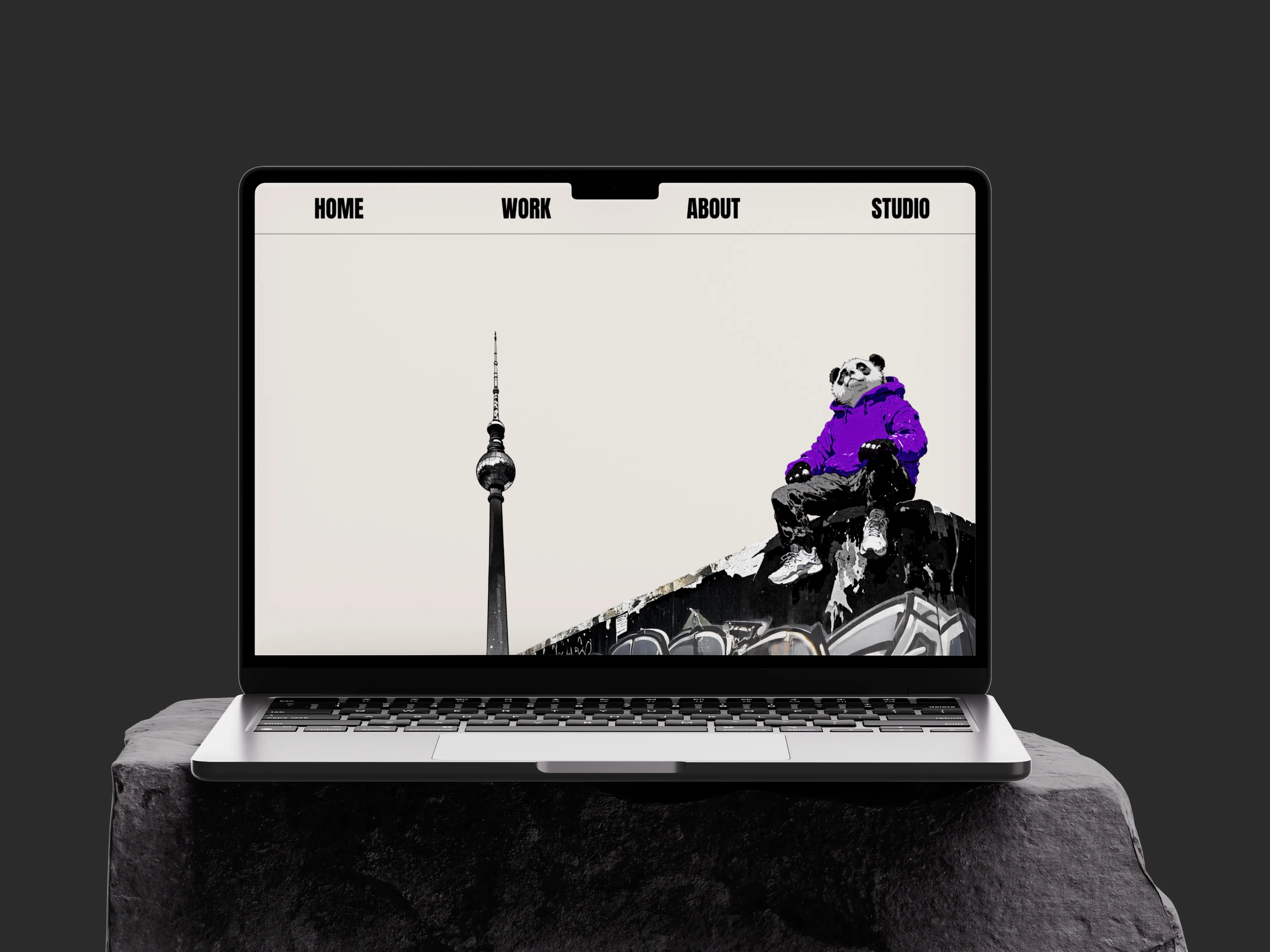
Beyond the hero, the build focused on a consistent system: a clear type scale, disciplined spacing, and a rhythm of light cream cards against black spec panels that keeps a content-dense page easy to scan.
Reusable components mean every section shares the same visual logic, so the site stays cohesive as it grows and new content can be added without breaking the design.
The map section needed careful handling: an interactive SVG of the studio's region that behaves across every breakpoint, stacking vertically on smaller screens so the headline never compresses. Art direction leans into the panda world, bamboo, ink textures and a lone violet moon, giving the brand a distinct personality while keeping its sharp, technical, AI-native edge intact.

Motion is used with restraint to bring the page to life. Subtle scroll reveals, hover states and the mascot animation add energy and a sense of craft, while never getting in the way of the content or slowing the experience down. The result feels premium and considered rather than busy.

More Projects
Got a cool idea? This spot is waiting for your success story.