Bolder - Framer Development for a B2B Tech Branding Studio
Client
Bolder
Year
2025
Bolder is a branding and communications agency working with companies in the categories that are hardest to explain: robotics, AI, biotech, energy, and deep tech.
A branding agency's own website is a live proof point. If it feels generic or breaks on mobile, every claim on it gets quieter. The design was motion-heavy and visually ambitious, and it had to stay fast.
I came in as the Framer developer and owned the build end to end. Architecture, components, motion, CMS, responsive behavior, SEO, launch, and ongoing support.
Scope of Work
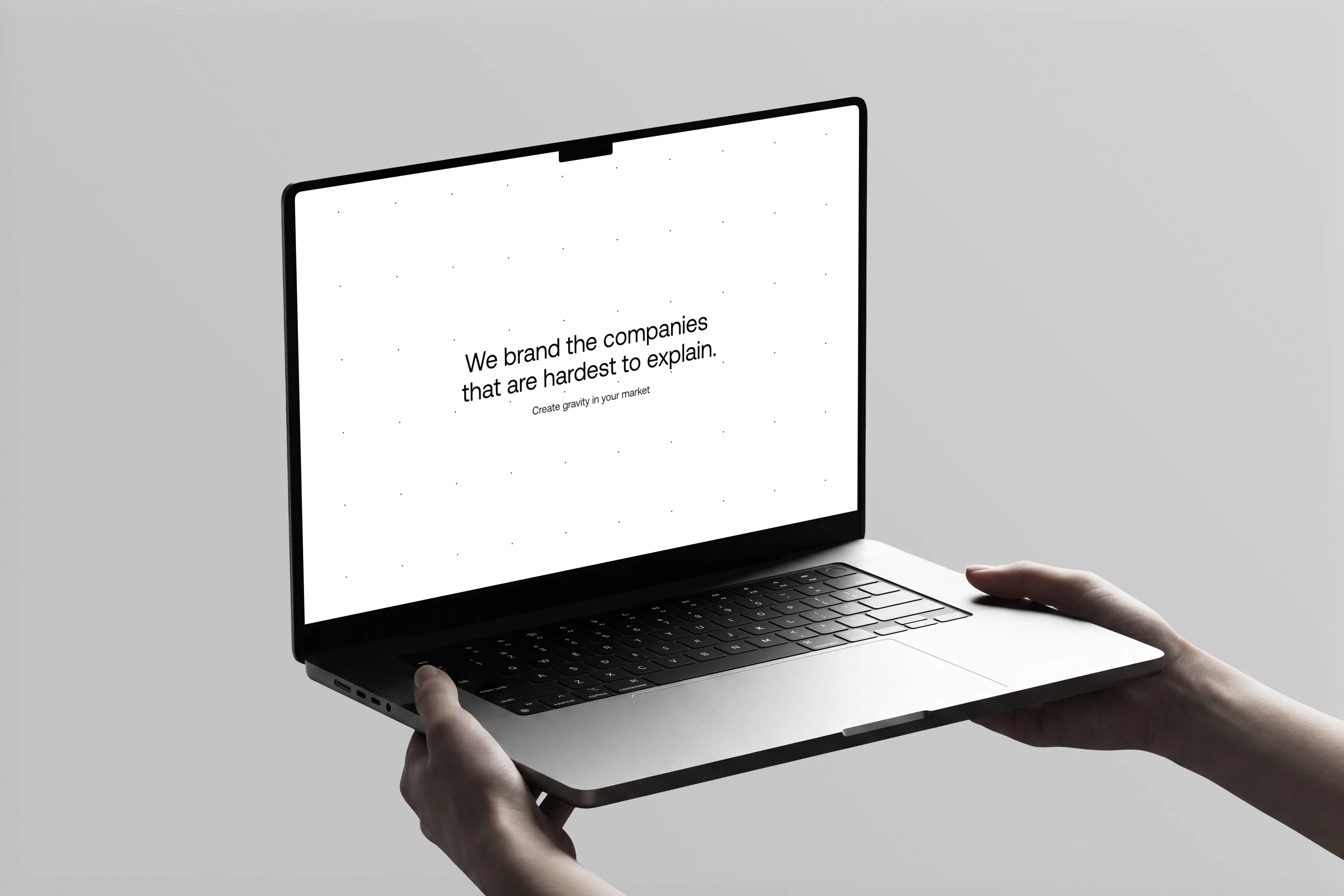
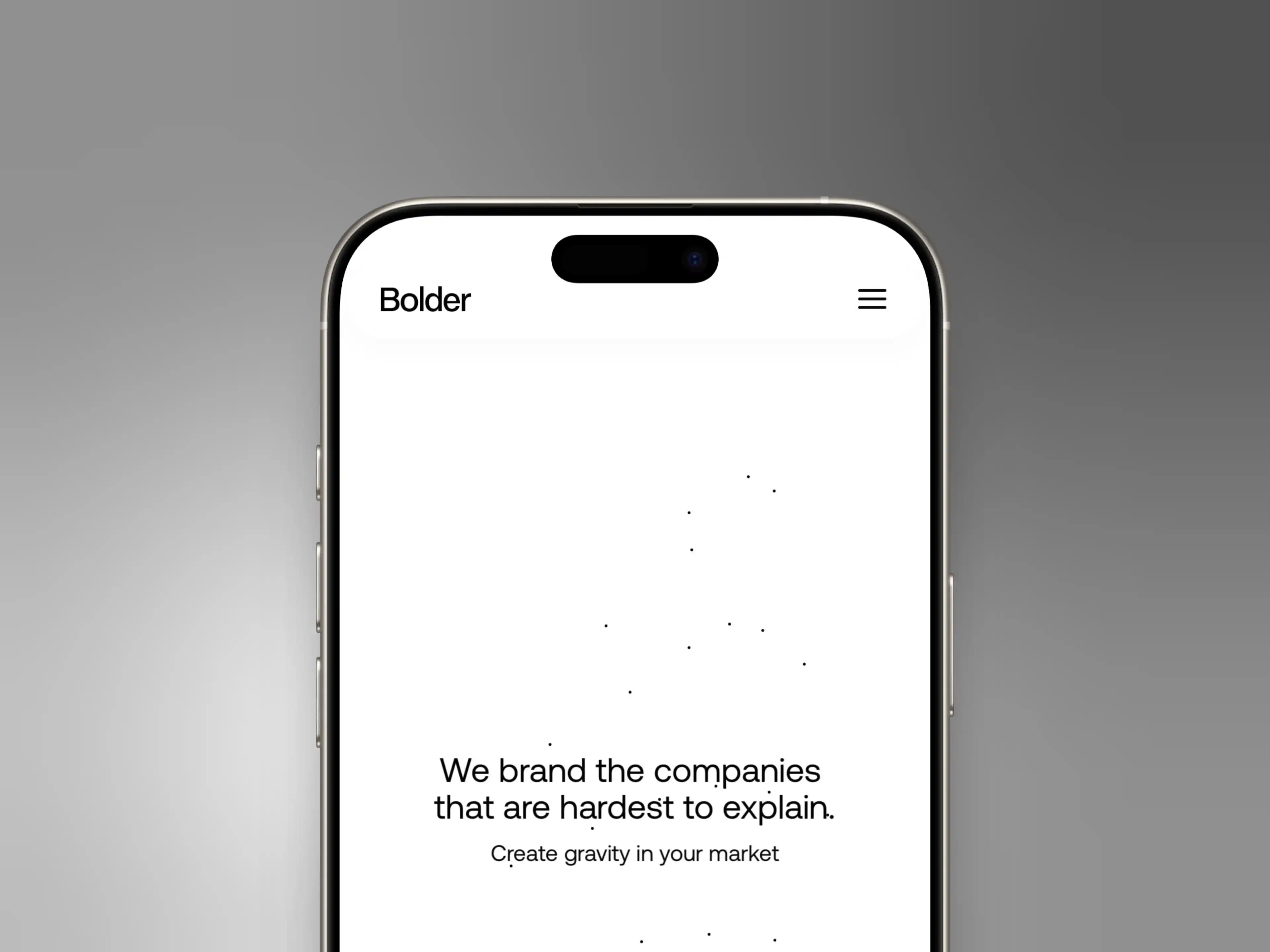
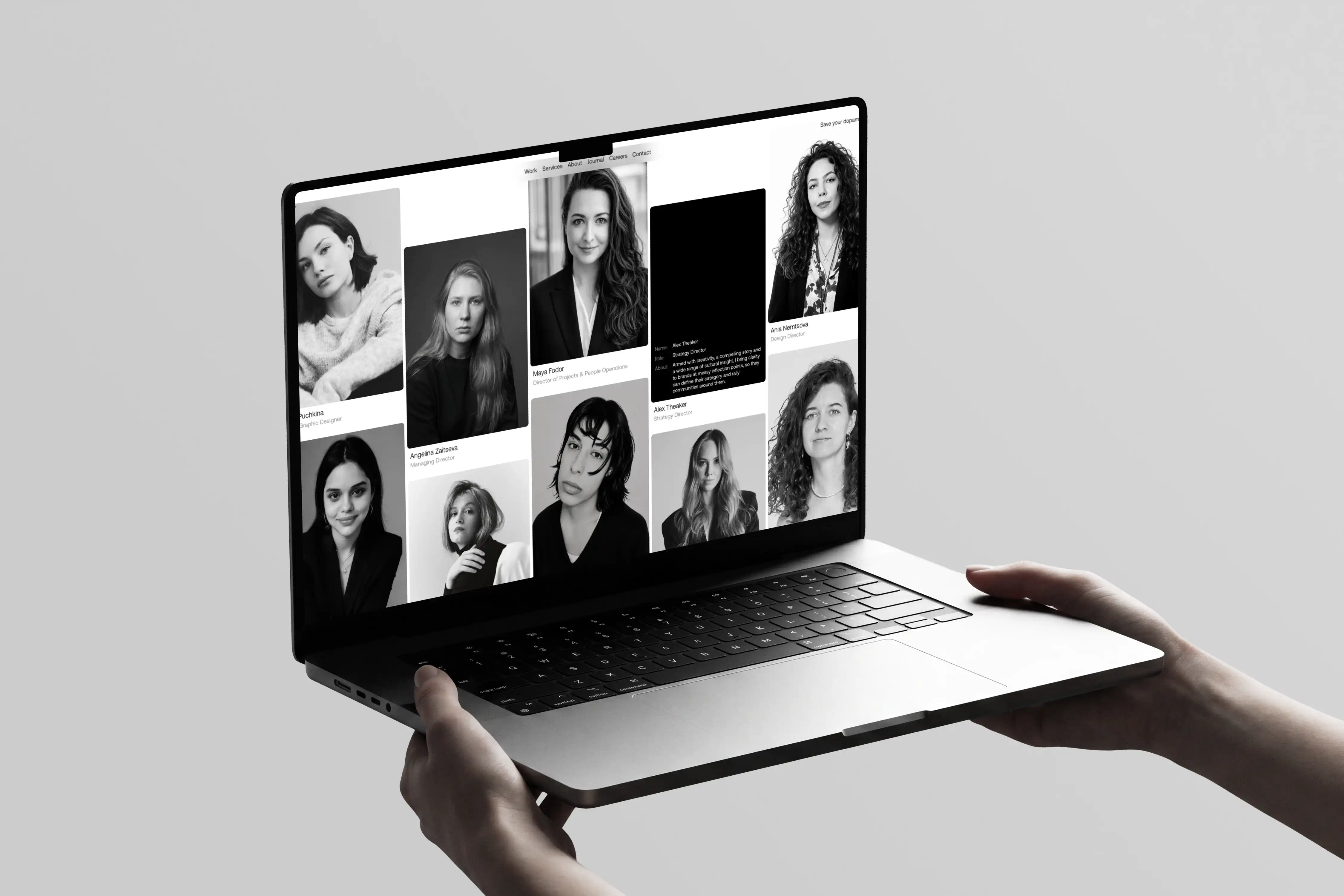
The brief was a full agency website built from the ground up on Framer. Homepage, Work with case studies, Services, Industry pages, Locations, Journal, About, Careers, Contact, Pricing, Manifesto, FAQ, and legal pages.
The main challenges were:
• A custom preloader, interactive particle grid, and glassmorphism navigation
• Scroll-tied animation running through the entire page
• A case study system that works as both a gallery and a long-form read
• A site-wide colour toggle affecting every component
• Keeping all of it fast on mobile
The hard part was never any single interaction. It was making all of them coexist without the site feeling busy.

I treated this as a system before a set of pages. Shared elements were built once as components with property controls, and every page draws from the same set.
Key decisions:
• Layout, CMS, and most interactions built natively so the team can edit them
• Custom code only where Framer genuinely can't go, like navigation that reads the background behind it and inverts in real time
• Every code component exposes controls in the panel, so editing feels identical either way
• Motion tied to its own section rather than page scroll, so it behaves the same on a laptop and a 32 inch monitor
When copy changed late on the industry pages, it was a content edit, not a rebuild.
Save your dopamine. A toggle in the navigation that flips the entire site between its monochrome default and full colour.
Bolder wanted visitors to control how much visual input they take on. Every component was built with both states in mind from the start, so the switch is instant, global, and holds as you move between pages.

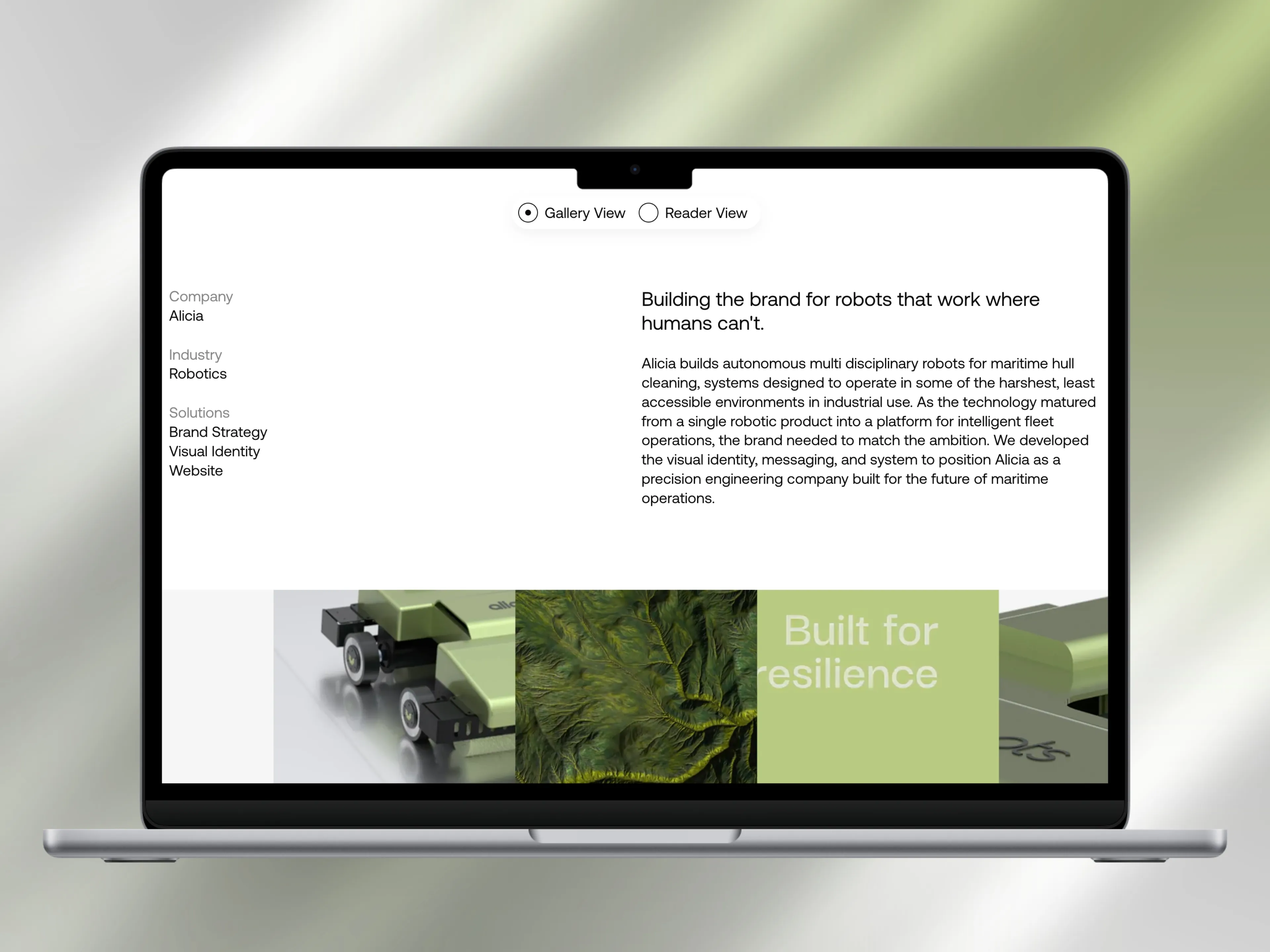
Case study pages with Gallery and Reader views. Every project page ships with two ways to experience the work. A Gallery view for scrolling through visuals, and a Reader view for the full narrative.
The toggle moves between them while sharing components underneath, so both stay in sync as content is updated. Visitors choose how deep they go, and Bolder maintains one set of content instead of two templates.
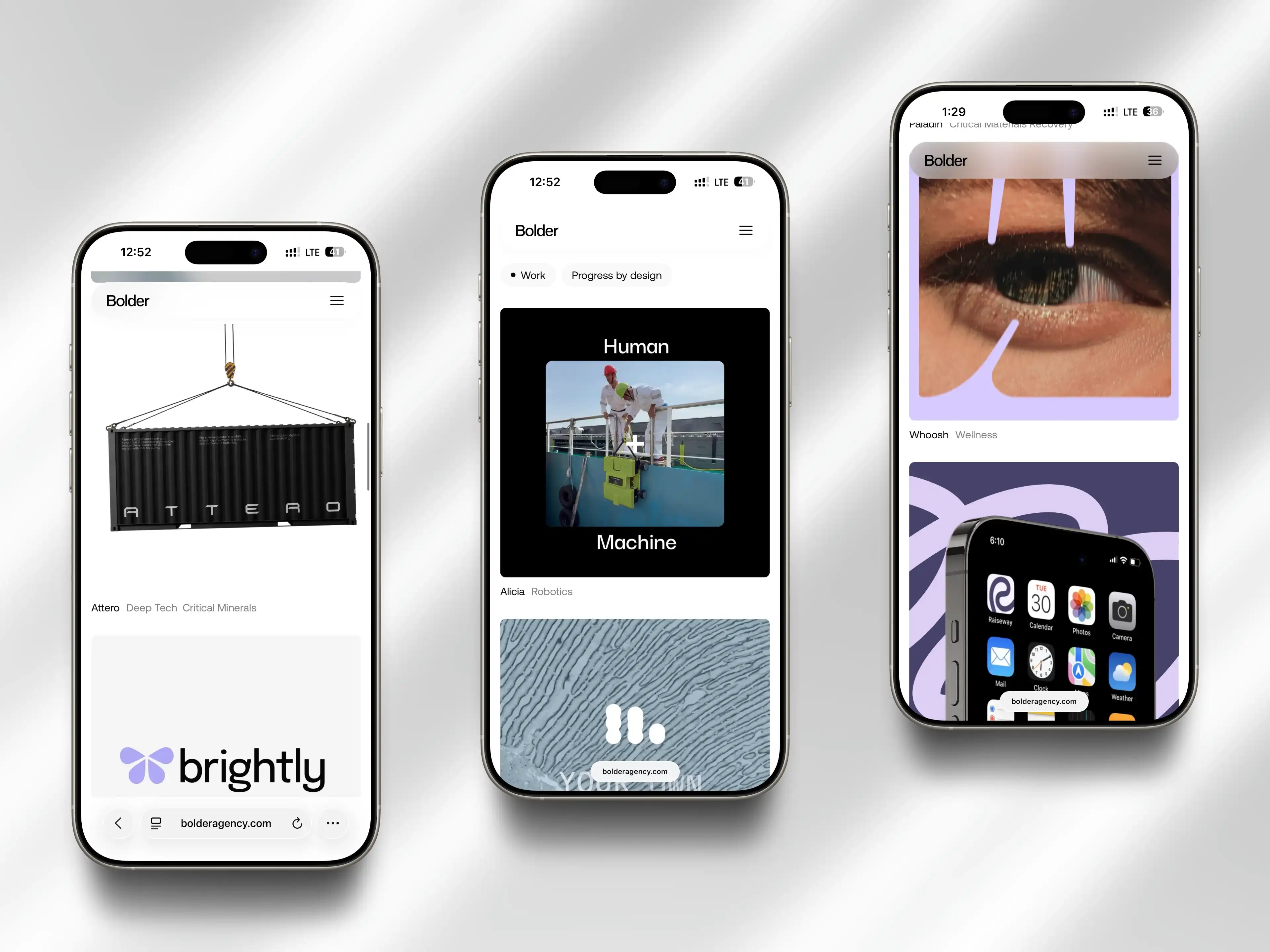
CMS-driven Work and Journal. Article system, case-study system, and Load More flows built for scale. New entries inherit layout, motion, and SEO setup automatically, so publishing never needs developer time.
Responsive across three breakpoints, and built to stay fast. Desktop, tablet, and mobile were treated as three distinct experiences rather than one layout squeezed to fit.
Performance work:
• Videos compressed and encoded before going near the site
• Ambient clips hosted externally by URL to keep the project file light
• Layout video uploaded directly and lazy loaded below the fold
• Lottie files trimmed, images served in modern formats at breakpoint sizes
• Particle and cursor components throttled to animation frames
The site carries a lot of motion and still loads like it doesn't.


More Projects
Got a cool idea? This spot is waiting for your success story.